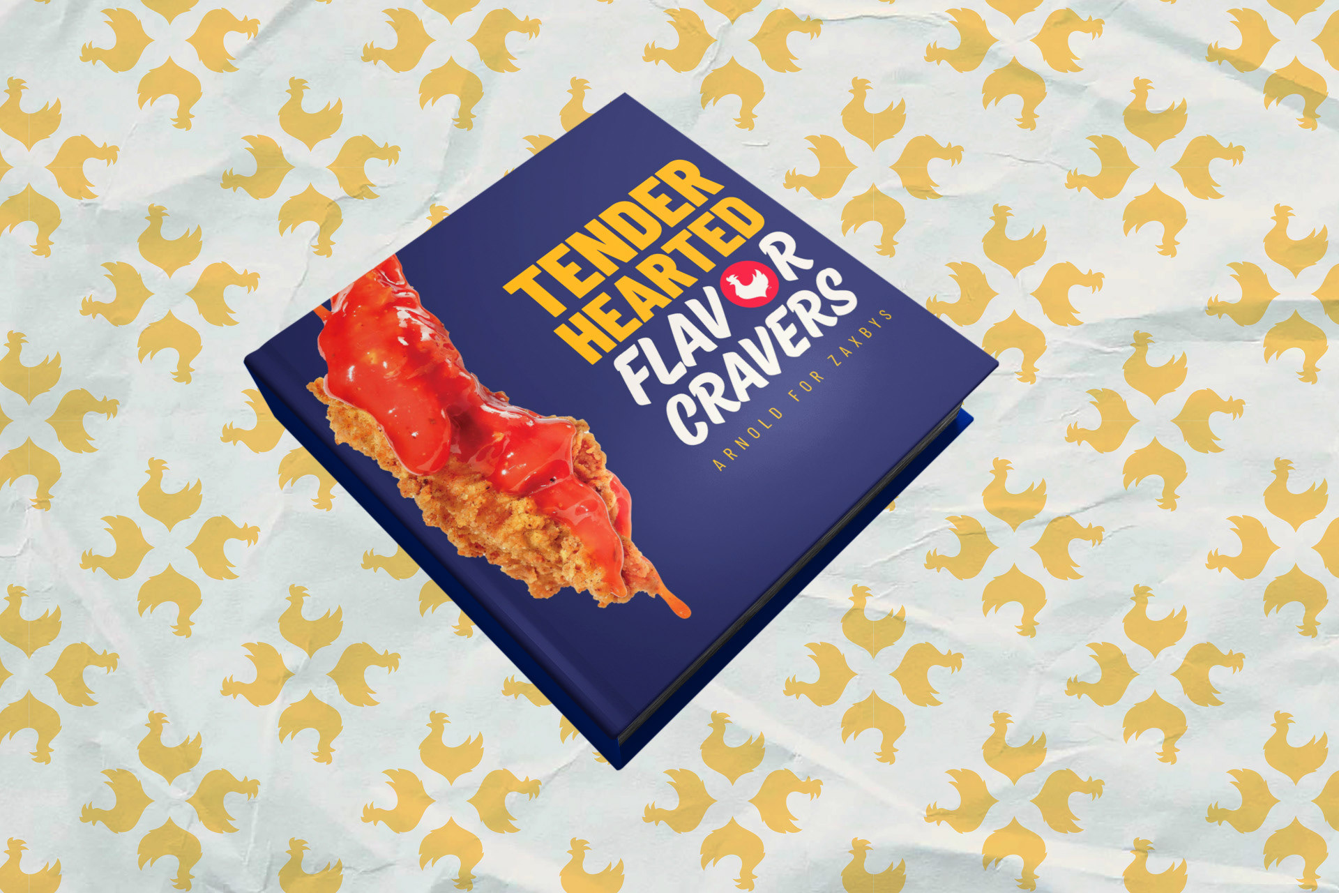
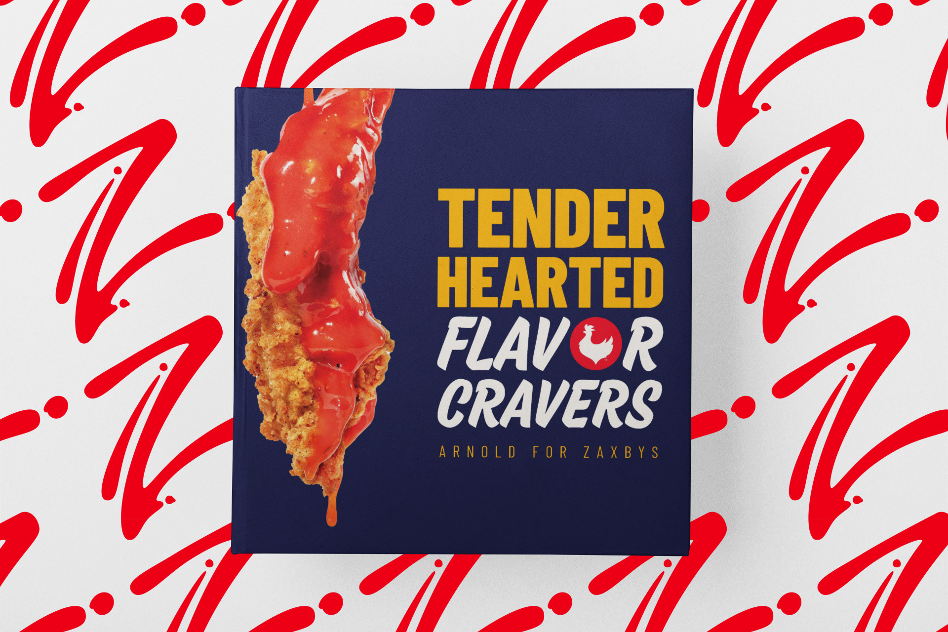
I worked as a Graphic designer on this pitch, collaborating closely with the strategy and creative teams to reimagine how Zaxby’s could be seen by a broader audience. As the designer, I developed the visual direction for the pitch—creating how it would look and feel, while staying true to the brand’s existing color palette and identity.
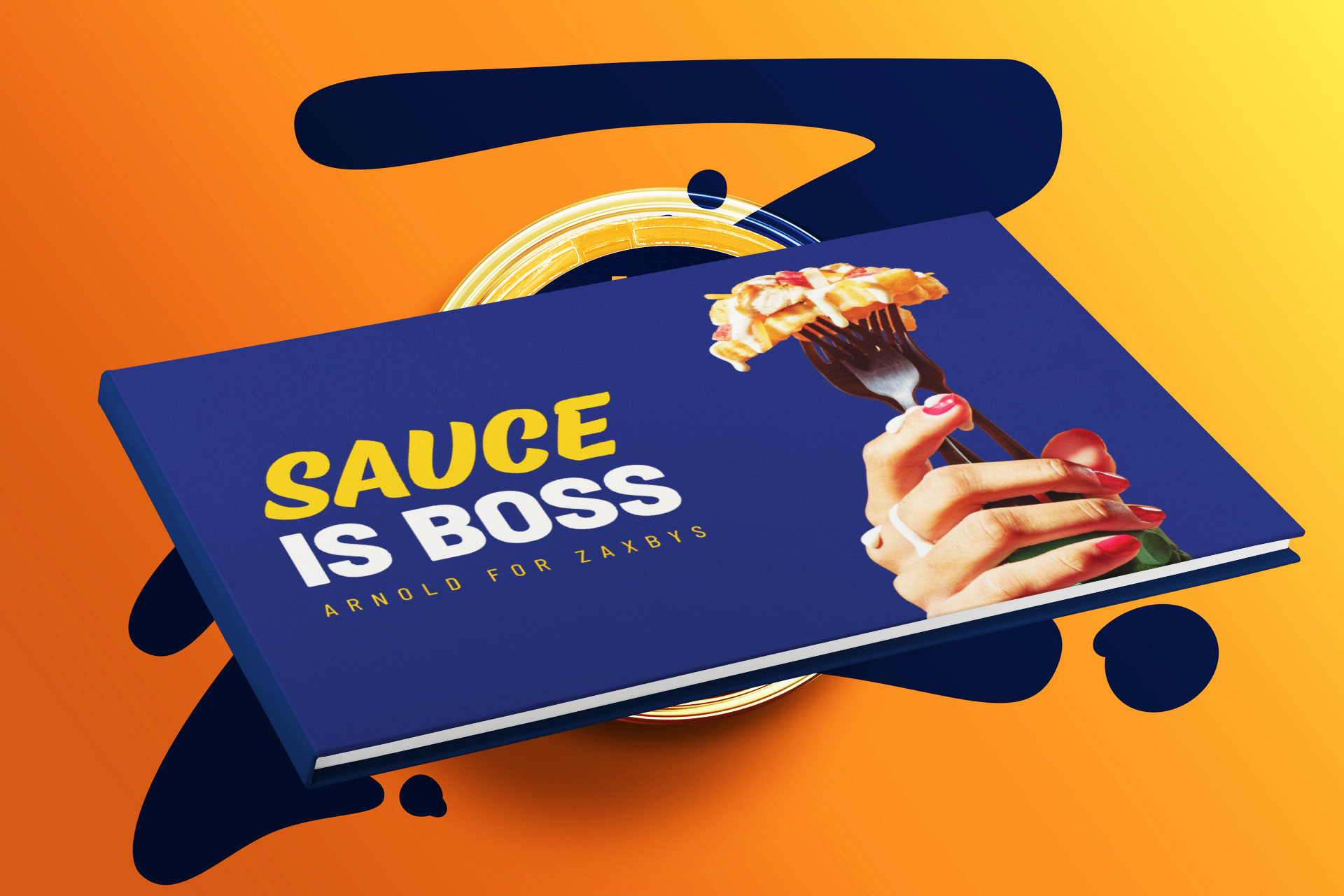
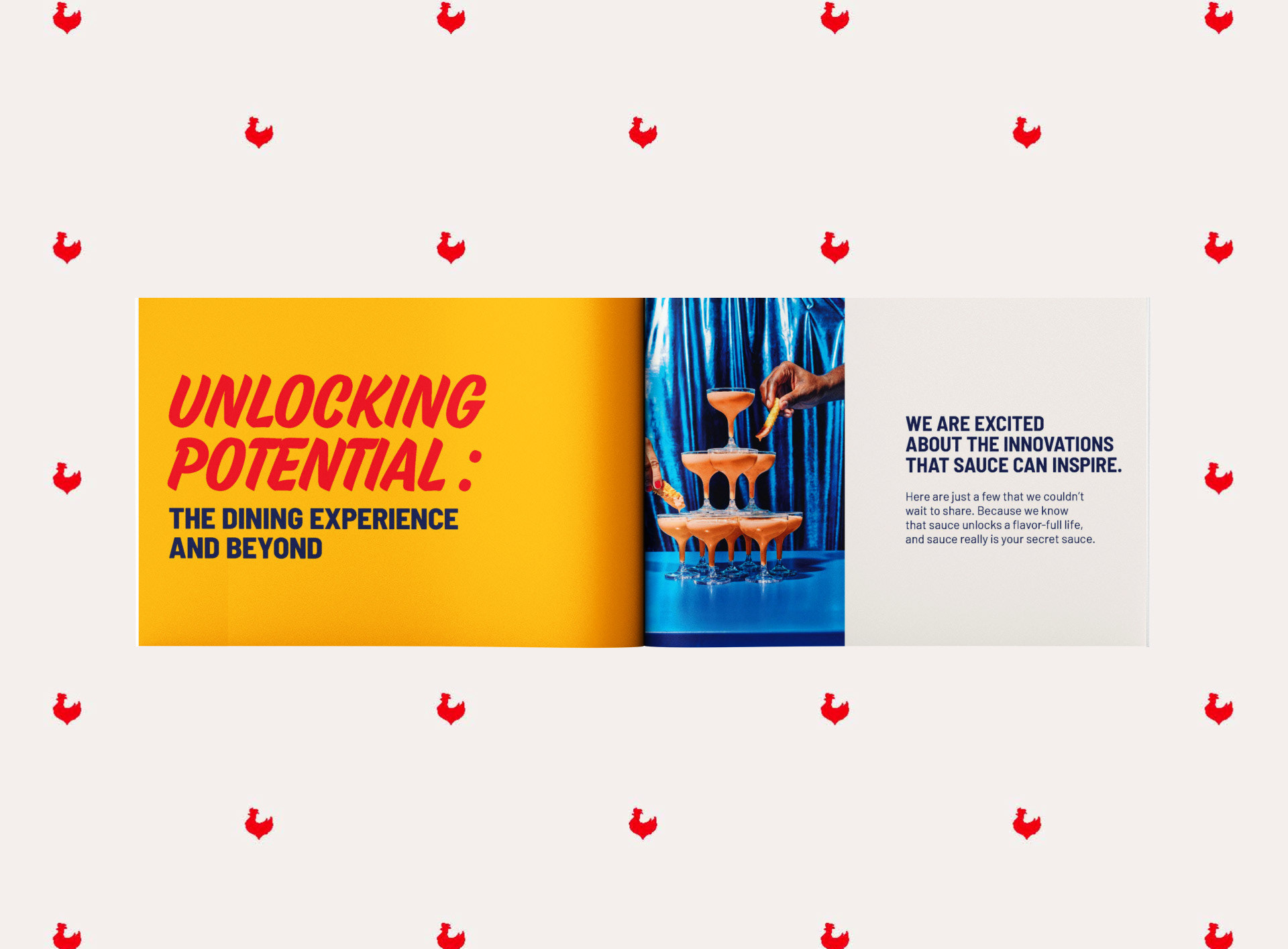
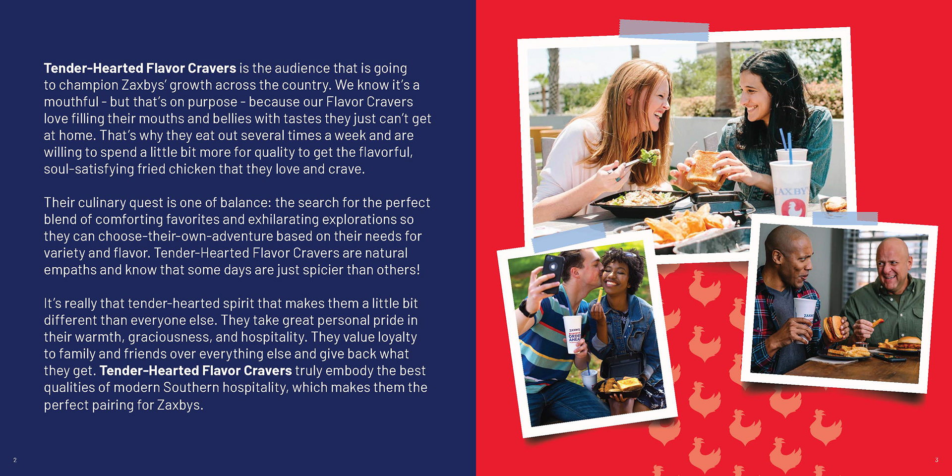
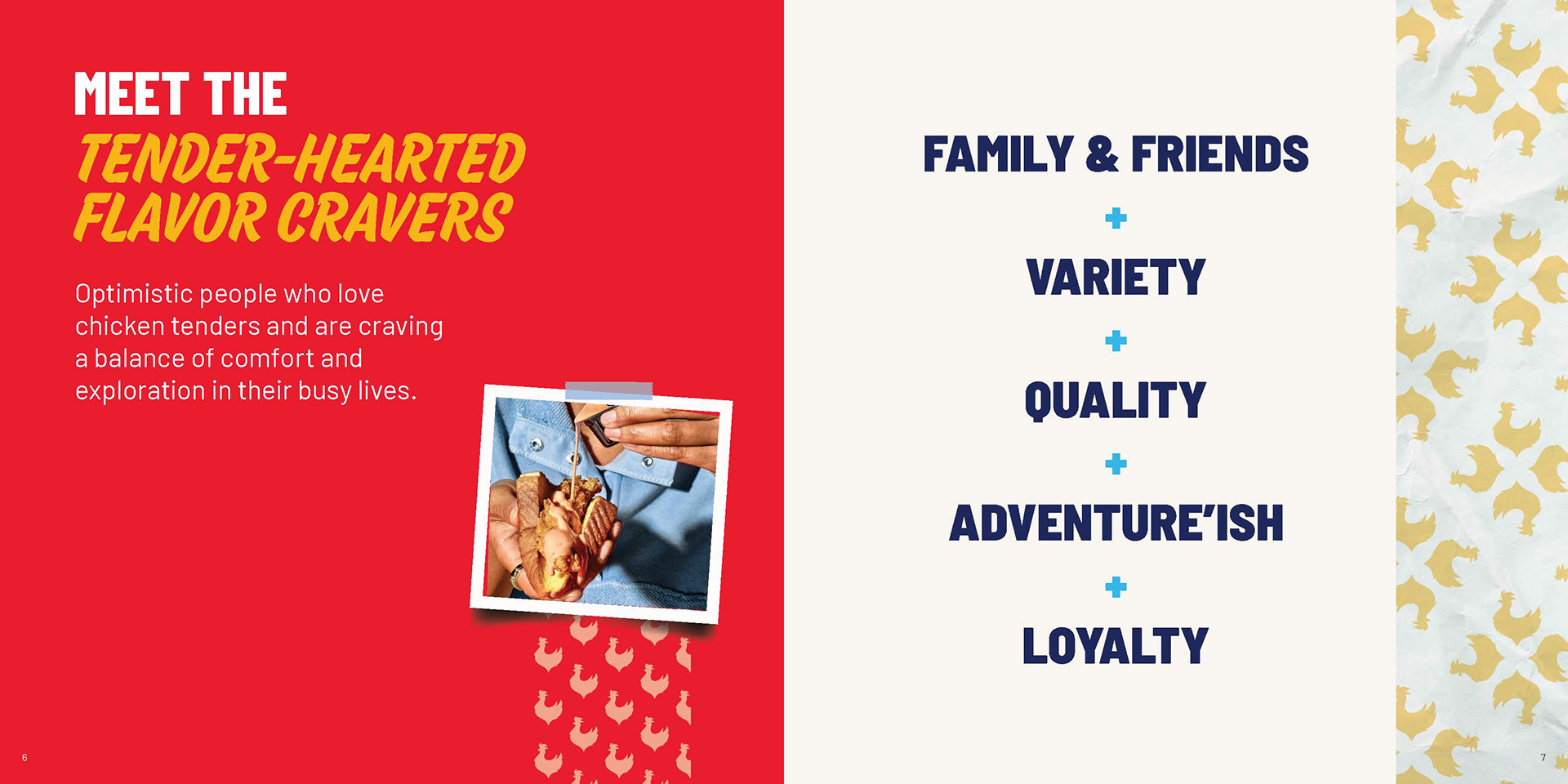
I designed a fun, elevated book concept that showed how we could keep Zaxby’s recognizable personality but make it more modern and vibrant. We used Polaroid-style imagery to evoke a sense of nostalgia and warmth, reinforcing the brand’s homegrown, down-to-earth feel.
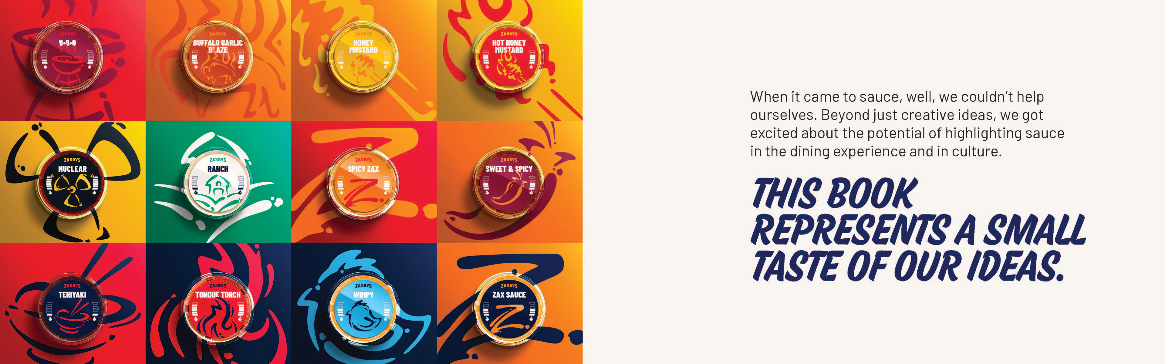
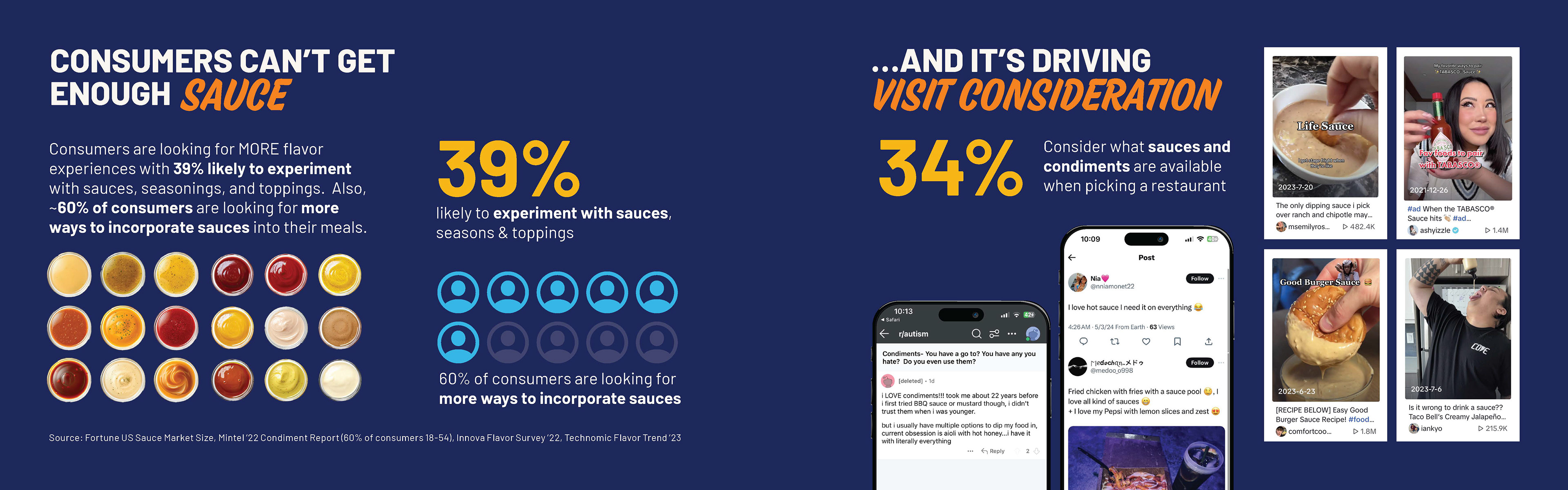
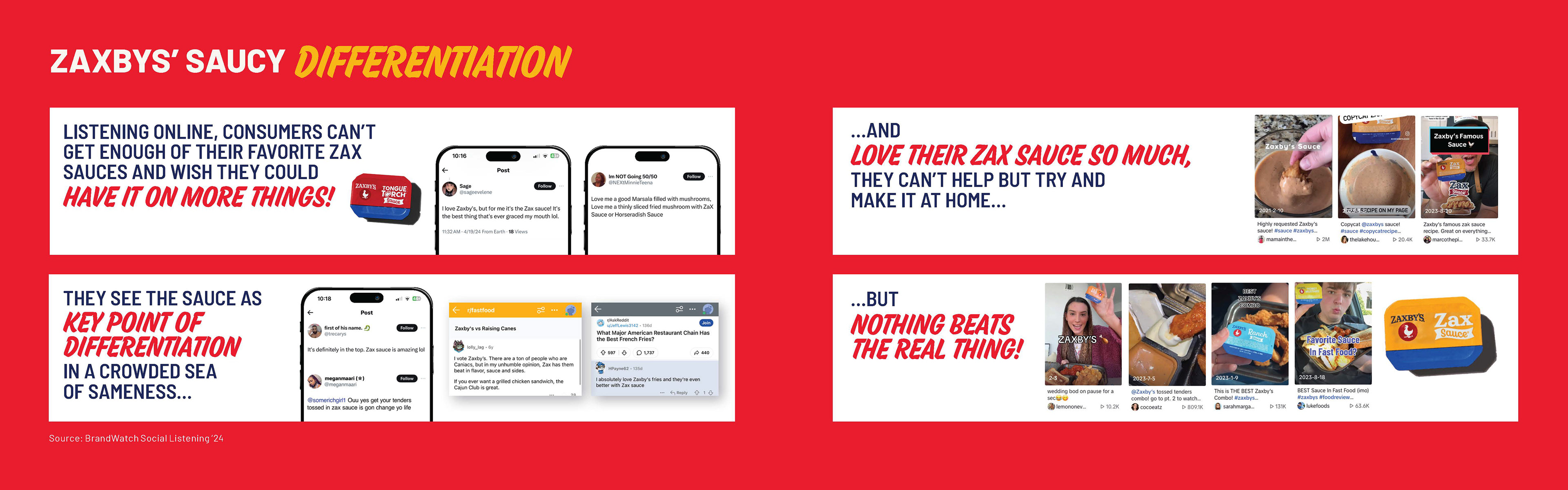
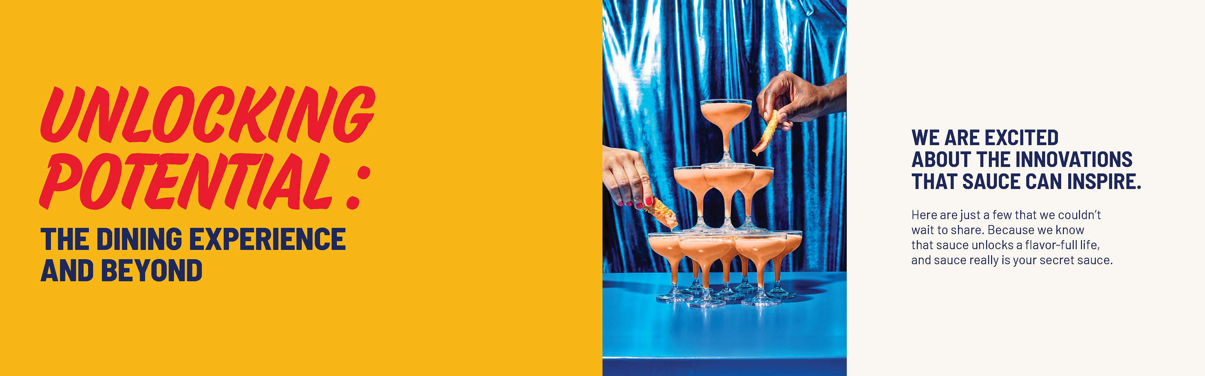
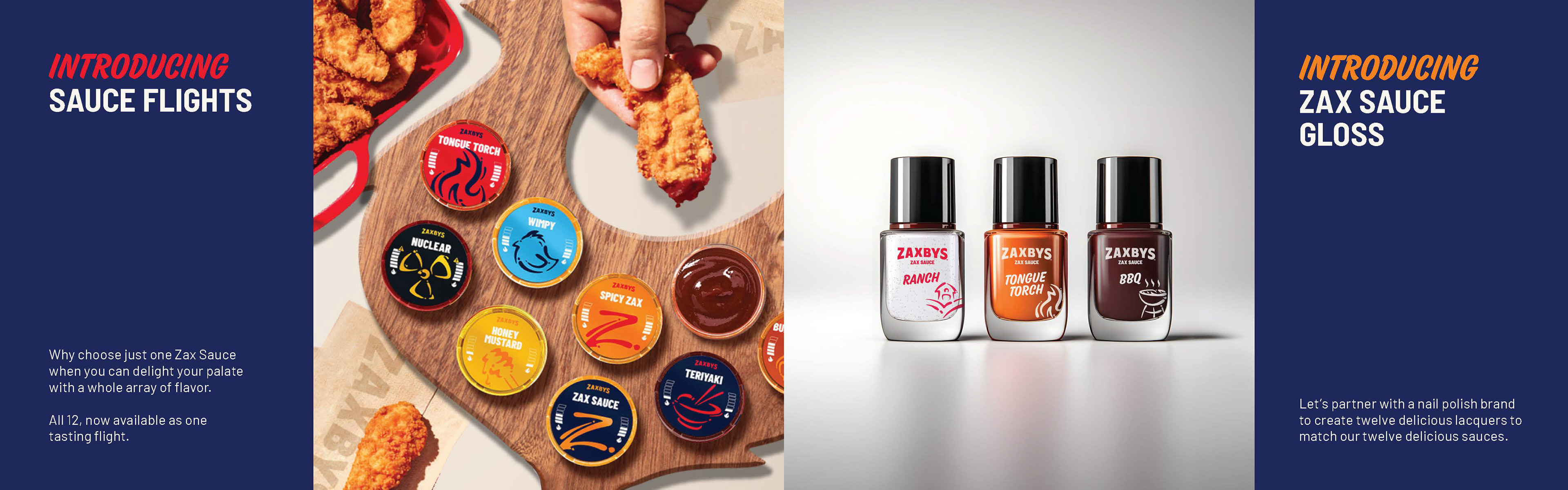
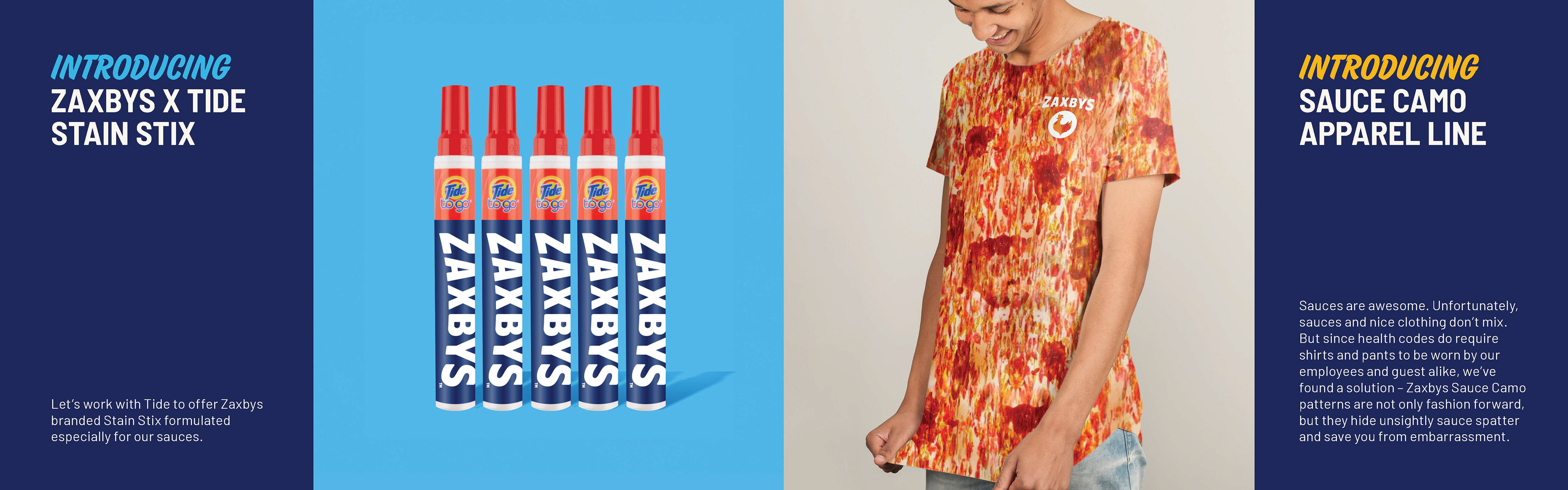
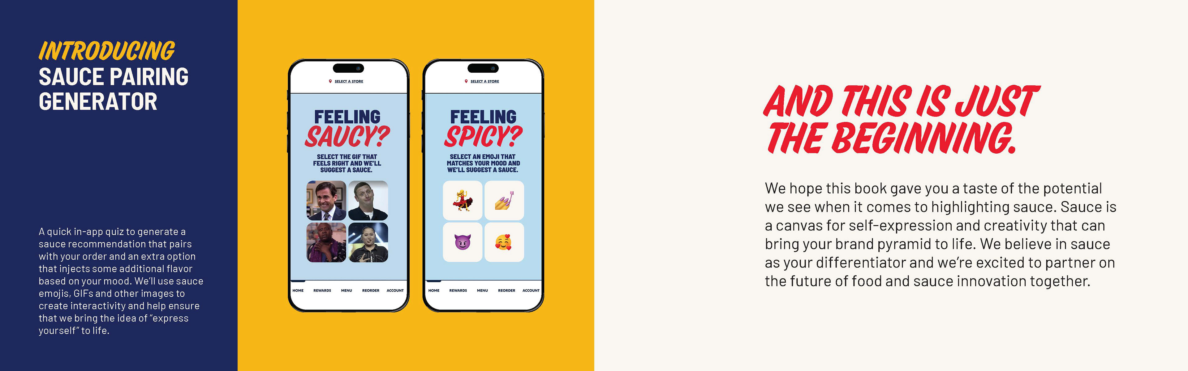
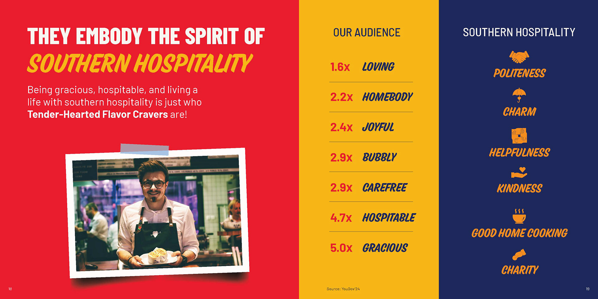
The result was a visually engaging presentation that brought our strategy to life, highlighting Zaxby’s sauces as the heroes in a fresh, flavorful way. From concept to visuals, we explored bold, flavor-driven ideas including a “sauce book,” color palettes, and playful extensions like sauce-inspired nail polish.
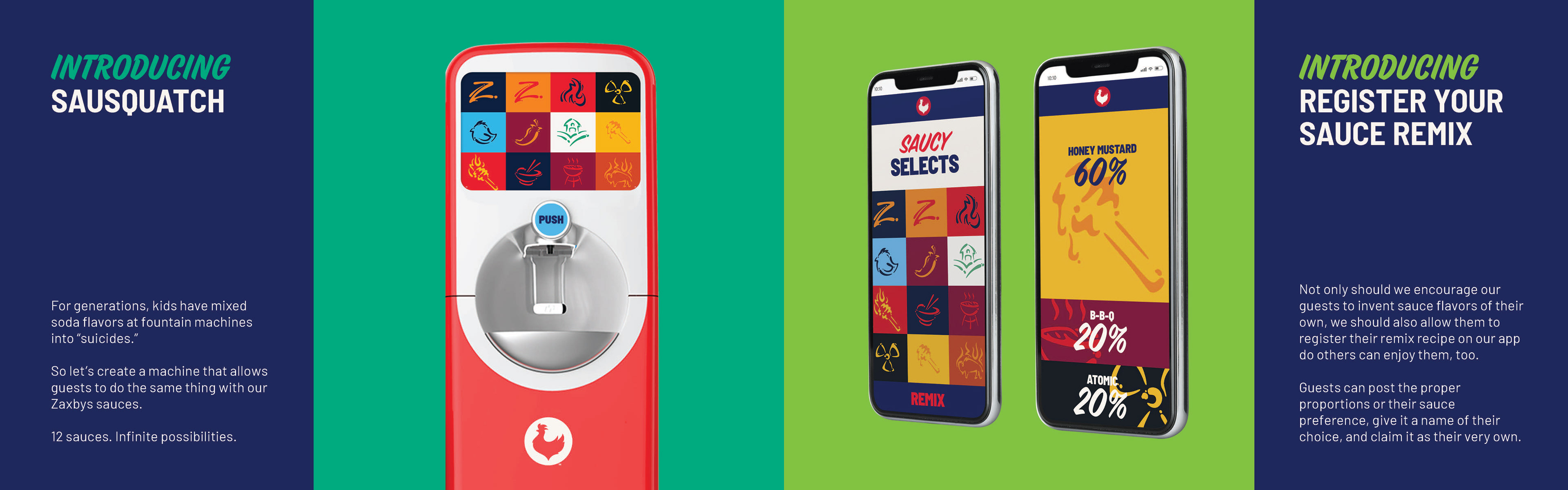
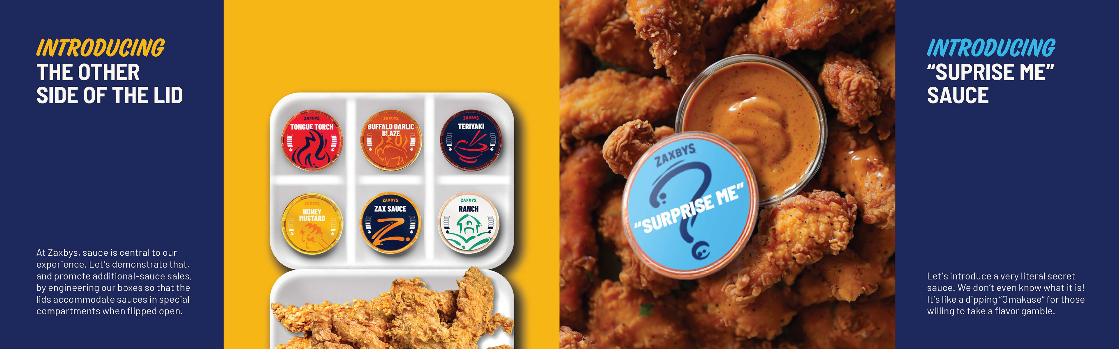
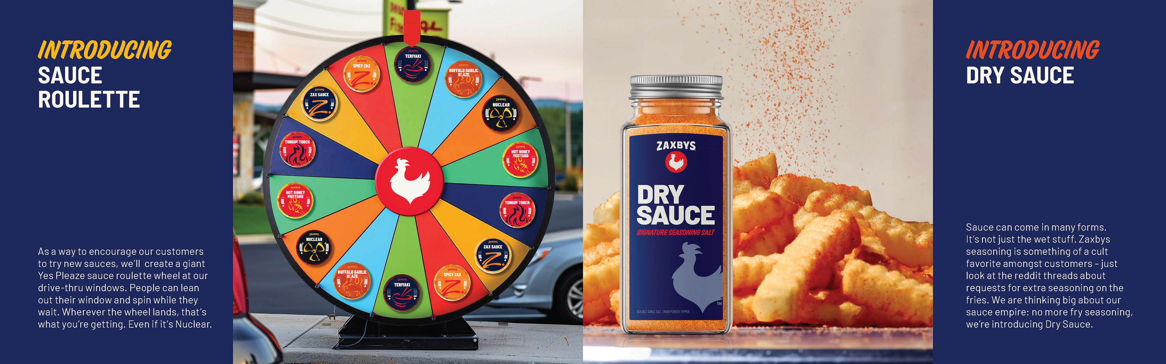
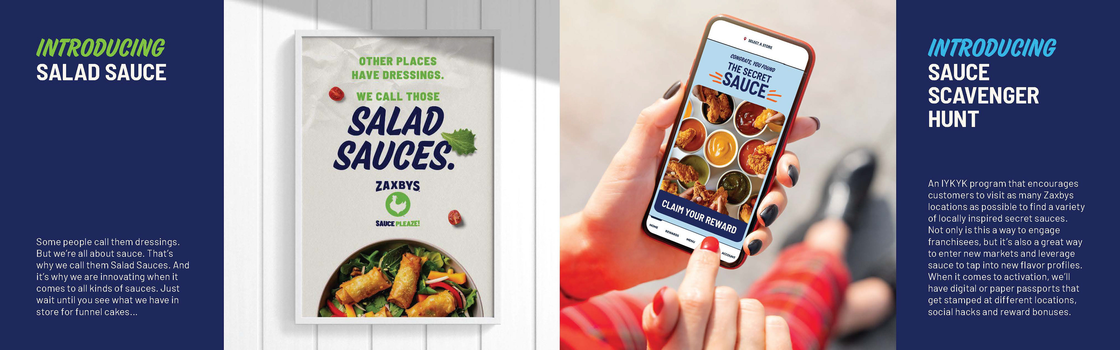
SAUCE IS BOSS